Thursday, January 31, 2008

A Shared Love of Wooden Bowls


DNfromMN wrote in to tell us about his (her?) recent score at HomeGoods:

I wandered through this evening and came across some reclaimed stump furniture and bowls. I was able to grab a small one [seen above] for my apartment-sized dining room table. The bowls range from $15-60 with most being around $30. So cheaper than anything I've seen on the net before.

So true, DNfromMN! I love your funky new four-apple wranglin' wooden bowl. And the price (under $60) makes the whole deal even sweeter. But not as sweet as that tablecloth!

I have loved wooden bowls for awhile now. I keep my eyes peeled at antique malls and thrift stores, hoping to find the perfect (but affordable) large, communal-salad-type vessel. I've come across a number of excellent candidates but, as far as wooden bowls go, it turns out I'm rather picky and the ones I like are always craZy expensive.

Case in point: This large wooden bowl is gorgeous, so shiny and smooth! It's made from the native Hawaiian Koa tree, known for its strength and multi-dimensional, often golden color. This wood is used to make everything from ukuleles to canoes. [Mama Cardboard has a bowl very to similar to this photo and I'm thinking she got it when we traveled to Hawaii when I was barely corrugated. Mama C, confirm?] There are many reasons for me to love this big, beautiful bowl and, of course, it costs $368.

Porcelain is also down with the wood. [Insert Hardwood joke here.] She admires this set of Bamboo bowls from Crate & Barrel. These are completely affordable but, for me, they lack the intensity and depth I seek in a wooden bowl.

Along the same vein, we have these small wooden bowls from re:modern. They resemble the Crate & Barrel version except they have the added bonus of color. I think they're rather cute (as individual bowls) but I don't think I'd like this style in a large, serving bowl. I'm looking for something a bit more...wild...a touch more unique.

Which leads me to this: the pièce de résistance. This bowl is fantastic. According to hi+lo modern, this vintage bowl might be made from olive wood but definitely comes with two serving utensils. I love the color, the size, the swooping angle and the thinness of the lip. But it's still $150. At least I'm moving down in price!

If you're also dreaming about an affordable, big wooden bowl but don't live close to a HomeGoods, DNfromMN helpfully points out that HomeGoods is affiliated with TJMaxx, Marshalls, A.J. Wright, and Bob's Stores, so hopefully you'll find one of those (as well as the perfect bowl) near you.

Monday, January 28, 2008

More pom-pom rugs

Swell rug, available at Chiasso

Are pom-poms becoming a trend?

6 & 7

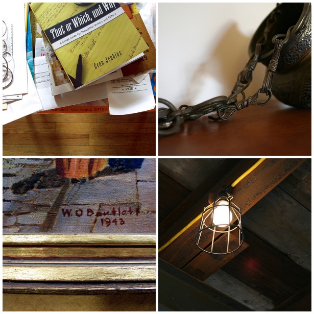
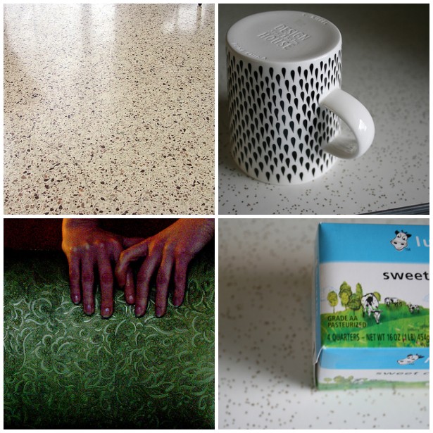
Here are our weekend photos. Visit flickr to see the entire 6 & 7 collection.

Cardboard: left, Porcelain: right

Original inspiration by Stephanie & Mav at 3191

Friday, January 25, 2008

Bonus Bone: Mushroom Basket

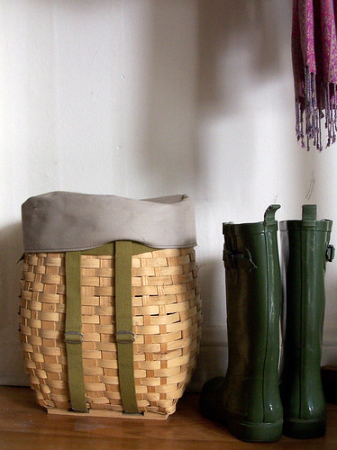
This rotund little basket exists for the sole purpose of collecting mushrooms. It's got a removable canvas top that snaps tightly into place. The green straps are there so that you can sling it onto your back, once it's full of fungi. It is the sweetest darn "backpack" you'll ever see.

The mushroom basket belonged to my grandparents and somehow it ended up with me. I'm not sure if they ever used it for its intended purpose but I like to imagine they did. Now, it resides near my front door and holds all my winter woolies. I haven't yet strapped it on to go foraging in the deep mushroom forests of Chicago but, one day, I might and it's nice to know I'm well-equipped.

For these reasons, I, Cardboard, declare this a Design Boner.

Thursday, January 24, 2008

My favorite new mug

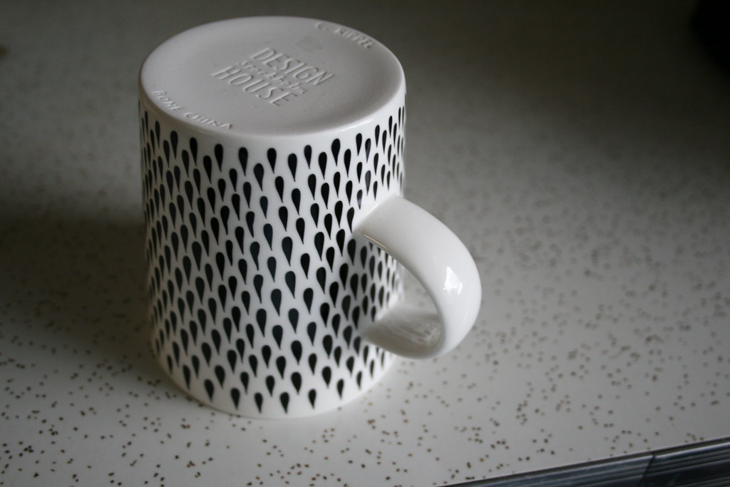
Bono mug designed by Catharina Kippel, available at Crate & Barrel

A couple weeks ago I popped into Crate & Barrel when I was hitting a few after-Christmas sales and using up some gift cards. I wandered around to see if there were any great deals or cute new items. That's when I spotted this adorable tear drop mug. I loved the shape of the handle, thickness, and pattern. When I turned the mug over I was excited to see that it was from Design House Stockholm. I certainly hope Crate & Barrel carries more products from them. There are three other designs available, for all of you Scandinavian design-loving folks out there. I think I might have to go back and grab a couple more.

Wednesday, January 23, 2008

Let Them Eat Pie!


I just heard that today is National Pie Day! Well, what do you know. Dash by the grocery on your way home so you can whip up your own delicious celebration tonight. Here are some fine pie accessories (and a couple of the basics) to help carry out your perfect pie project:

1. Wire and Ceramic 5-Tier Plate Stand, at ChefsCatalog. You don't need one of these to make good pies but it sure would make them look pretty in the end.

2. Sevilla Pie Server, at Casa 21 Limited. This online store is packed with beautiful flatware. A pie server really adds a touch of grace to your dessert experience.

3. Emile Henry Pie Plate, at Sur La Table. So sweet, with the ruffly edge.

4. Butter. Prettywar-stl's flickr pic reminds us that butter is most definitely a main ingredient for any decent baked good.

5. And, of course, the PIE. Smitten Kitchen loves a lattice crust and shows us, step-by-step, how we can learn to love it too.

Tuesday, January 22, 2008

Wooly Poms for Chilly Toes

PomPom Wool Rug, at Garnet Hill
Delightful! I love 'em both.

Monday, January 21, 2008

The El Camino Master Plan

Ever since I knew that cars meant more than just a ride home from soccer, I have loved the El Camino. This vehicle is the perfect blend of cool and trashy, car and truck. Even now, if someone gave me the choice between a brand new Escalade (or whatever the kids are driving these days) or a busted up, rusty Chevrolet El Camino, I'd say throw me the keys to the Cameen and get outta my way.


But my love for the El Camino is not necessarily automotive. I have no idea how safe it is, what kind of gas mileage it gets, how it handles a sharp turn, or how fast it will go. To be honest, I only love it for its body. The ridiculous combination of car (no, wait) truck gets me every time. Each time I see one (and I admit that it's been awhile), I can't help but smile. And, even though its title is translated as "The Road," I'd take my El Camino off the street and plunk her right in my back yard.

Wait, wait, though - this is not turning into some hillbilly fantasy! I do have a plan.

Check it: I want to find an El Camino and pimp out the body. I want it lacquered and glistening. I don't need anything fancy like iridescent paint, but something classic, like a smooth cherry red. It will need some kind of detailing along the body: my name painted in a swirling cursive or maybe some inspirational phrase (ie: Taking Care of Business). Basically, I want my El Camino to be the envy of the entire car show.

And then I want to situate my perfect specimen in my back yard or along the side of the house, build a deck around it, and (yes!) make it into a hot tub. I can hear you laughing now but this idea is genius, I tell you. Of course, the bed of the "truck" part would be the jacuzzi and the windows into the cab would open onto a...full bar & stereo system. Yes, yes, y'all; I have dreamt about this for a long time.

Which brings me to the main reason for this "Ode to Camino" post...

Daryl Hannah is selling her "Bad Ass Biodiesel El Camino" (1983) on Ebay and I so wish I had the room for it.

Thanks to Ecofabulous for the tip!

Stylish...Binder Clips?

If I had an assistant who chewed her gum a bit too loudly and wore her blouses a bit too tight, I'd buy these binder clips for her on her birthday. I know she'd love them because she'd start coordinating the enamel on her 2" long nails with her files.

But I don't have such an assistant. Guess I'll have to buy them for myself.

6 & 7

Here are our weekend photos. Visit flickr to see the entire 6 & 7 collection.

Cardboard: left, Porcelain: right

Original inspiration by Stephanie & Mav at 3191

Saturday, January 19, 2008

Pour Le Vin

Cru Wine Rack, at Panik
CrazySexyCool.

Friday, January 18, 2008

Cindy?!


The bad (and the overstuffed): Cindy Crawford Hathaway love seat, at Wickes Furniture

This morning when I turned on the TV to check out the weather, I saw a commercial for Wickes Furniture featuring Cindy Crawford saying she designed a lined of furniture for them. Huh? Wait, huh? Cindy Crawford? Really?! Furniture?

On my commute into work, I had a brief moment of hope. Maybe after all those years of working with Todd Oldham on House of Style some good design sense rubbed off on her. Or would it be more like her acting career? Please don't make me relive the summer in high school when I worked at the movie theater and Fair Game came out. SHUDDER!

The more I thought about it, the more this line confused me. Who is this marketed towards? Women redecorating their living rooms who think Cindy Crawford is hot? Hmm, maybe not. Will telling your husband that Cindy designed this sofa sectional make him want to get it? I really have no idea, but either way Cindy really cannot wait to be part of your home.

Overall there are a LOT of over-stuffed, chunky, dark-stained, heavy things. So perhaps they are appealing to a certain male. There are a couple pieces that I actually thought was rather nice looking. My favorite piece is the rounded sectional couch. It seems very Hollywood Regency glam. So maybe a tiny part of Todd rubbed off on her.

I guess this line will always be a bit of a brain teaser for me. I know one thing for certain, Cardboard and I are definitely going to attend one of her personal appearances and ask her to sign our sofa!

Bonus Bone: Rings glasses

Rings glasses, available at Crate & Barrel

Everyday glasses aren't the rock stars of the design world, but when you have crappy glasses that break all the time, you start to appreciate a nice, solid, well-made glass. For our wedding, Hardwood and I asked for a bunch of pint glasses and all but two broke before our first anniversary. (Thank god, breaking a glass doesn't carry bad luck like mirrors!) We restocked with Crate & Barrel's ring glasses. They're solid and have a nice classic design. And I'm happy to say not a single one has broken (knock on wood).

For these reasons, I, Porcelain, declare this a Design Boner.

Thursday, January 17, 2008

Covet/Own It: Art Deco Bar Cart


Chip Kidd has been all over the web lately. I've never heard of him until now but, apparently, he's a bad-ass in the world of (book cover) design. I learned the most about Kidd from Door Sixteen, who wrote this knowing post about his recent Dwell interview. (Thanks for the "most rockstar" scoop, D16!). She also linked to this few-year-old New York Times tour of his house. This is where this post gets interesting...

The photo on the left was taken at Kidd's apartment. According to the NY Times, the "nickel and glass rolling tea cart" cost $2,000 and was purchased at Skyscraper Antiques.

The photo on the right was lifted from the Target website because, the day before all this Kidd madness, I bookmarked it and sent it to our friend, Formica, who has a thing for funky furnishings (and drinking). Target's Roaring 20's Serving Cart is made from "nickel, metal, classic glass" and costs only $230 (minus a 15% discount, if you act now).

If you're like me (and Formica) and can't afford to drop two grand on a serving cart but might be able to scrounge up a couple hundred, I'm happy to present you with the Target version. Just make sure to read the reviews because there seems to be some issue with the wheels.

Wednesday, January 16, 2008

Plate Tile

Covering Plates, designed by Karl Zahn
This is one of those, "Duh, why didn't I think of that?" moments. A simple but brilliant repurpose idea always tickles me. This wall cover technique might be basic, easy, and cheap but it's got its thumbs all up in my armpits. This is awesome.

Tuesday, January 15, 2008

Michaels Framing Update

#841, by Ray Hartl
I did it. One year after receiving my Ray Hartl photograph (seen above), I finally got it framed. Well, it's getting framed, currently.
I took advantage of the Michaels 60% off custom framing sale. I know some of our readers said that I should be wary of the Michaels discount but I decided that if I didn't do the deed with even the idea of a discount, I'd never do it. Here's how the job broke down:

Photograph Measurements (already single-matted, in white): 32" x 32"
Glass (I opted for the "Masterpiece" glass, which reduces glare and optimizes detail - see middle panel below): $222.25 ($88.90, with discount).

Mounting & Fitting (whatever that really means): $44.50 ($17.80, with discount).
Frame (I had to opt for a much thicker frame than I had first picked out because the thinner frames wouldn't hold the weight of the glass): $314 ($125.60, with discount).

This all totals up to $606.40 (without the discount), which is almost double what the photograph itself cost. With the sale price, I paid only $263.78.
I think that's a pretty good deal and, in about two weeks, I'll show you what a good deal looks like.

ps. I received no hassle about the artist's signature on the piece.

Monday, January 14, 2008

6 & 7

Here are our weekend photos. Visit flickr to see the entire 6 & 7 collection.

Cardboard: left, Porcelain: right

Original inspiration by Stephanie & Mav at 3191

6 & 7 - Sick time

Our weekend photos from the first weekend of 2008 were delayed because I was out sick with a nasty stomach flu. Boo!!! Here are our weekend photos from January 5 & 6. Visit flickr to see the entire 6 & 7 collection.

Cardboard: left, Porcelain: right

Original inspiration by Stephanie & Mav at 3191

Sunday, January 13, 2008

INV/ALT Magnetic Design


I've had my eye on INV/ALT Design for awhile. I first took notice of their Snap Cups, small espresso-esque cups with snaps embedded in the sides. A novel idea, true, but I thought the effort of snapping the cups together combined with liquid might prove slightly disastrous.

But now INV/ALT (which stands for INVention/ALTeration) has debuted Magnetic Cups. Same idea: two-ounce cups with a super-strong magnet (instead of a snap) embedded in the side. Not only are the cups easy to locate for morning espresso (as they're magnetically attached to the machine) but they would also inspire an exciting game of Quarters.

Weekend Flings

Friday, January 11, 2008

Bonus Bone: a Wireless Router

Finally! After about four hours of pulling our hair out, searching our computers for "wireless adapters," and dialing up the customer support at both Linksys and Comcast, Bamboo and I finally have our wireless up and running.

Previously, my laptop was tied down to one spot, chained to our old non-wireless router. Or, if I wanted to float about and be connected to the internet at the same time, I had to glom onto some stranger's shady "insecure" wireless connection. No more!

Working on my 2008 goal of simplifying life, I bought the wireless doo-hickey and, after only a few frustrating hours of general configuration, I am now able to sit on my couch and blog. I'm not sure if extending my blogspace is a healthy thing but I will say that, for tonight, it's all very exciting.

For these reasons, I, Cardboard, declare this a Design Boner.

Thursday, January 10, 2008

How I'd Sell It: Red Table Runner

Etsy vendor, Couch Design, says this table runner is perfect for Valentine's Day. I get the whole "red + white = love" thing but this item does not turn my wistful thoughts to roses, kisses, or anything involving candy and cards. In fact, the only thing I see when I look at it, is a track suit. And unless you live in... [insert your idea of a trashy city here & then tell me in comments!] ...track suits aren't terribly sexy.

As for marketing, Couch Design was nearly on target with the title of the item, Racing Stripe Table Runner. In my bloghead, I tried to figure out a better (and non-romantic) angle:

Hmmmm...Track suit...table runner...

Then I exploded into giggles because the dang thing just wrote itself.

Wednesday, January 09, 2008

Framing on Sale at Michaels

Git yer pitchers ready, y'all! Michaels is having a framing sale! From now until Saturday, all custom framing orders are 60% off. I'm finally going to get my enormous Ray Hartl photograph done up.
And just look how happy that Michaels employee is to help out with decisions on matting and wood grain selection. I hope he works at the one in Skokie.

Gimage: So Sick, So Sad

Porcelain is really sick with some kind of stomach virusy thing. Doesn't sound like she's having much fun at all.

Let's all send her thoughts of (un)chicken soup and vitamins.

* Gimage = Image found when stated phrase searched in Google

Tuesday, January 08, 2008

Sample This

I've always been too cheap to buy paint samples. This aversion usually backfires on me and I end up slapping up a wall color that isn't exactly right. I'm starting to believe that spending a few extra bucks to really know what I'm getting into isn't such a bad idea.

Looks like Bree, of Sweet and Bitter fame, agrees with that theory. Check out the amount of samples she bought to color test for one measly (yet certainly well-constructed) mantel, some bookshelves, and a guest room. "Holy cwap" is right!

After seeing photographic proof of such impressive color anality, I won't feel bad picking up, say, two or three testers the next time I paint. Or maybe I can just write to Bree and request her leftovers.

Sunday, January 06, 2008

Mercer St. Sideboard & the Resulting Pickled Oak Obsession

Trevor O'Neil of T.O.D. has gone and topped himself. His latest creation is this beau-ti-ful sideboard in pickled oak. The piece has a light, gauzy quality despite the fact that it sits squarely on the ground. The recessed handles are a nice touch and it looks like it feels soooo smooth.

Sadly, it's already been sold but it was priced at $7,000 so I couldn't have afforded it anyway. The pickled oak treatment has me inspired though. I'm thinking-thinking-thinking about ways to bring it into my own home (for less than seven grand, of course).

Friday, January 04, 2008

Bonus Bone: Gwen Frostic mini calendar


2008 mini calendar by Gwen Frostic

I always feel a little melancholy at the beginning of new years. The celebration, family, and days off are all over with and ahead of me is several months of cold weather with very little sunlight. I used to make resolutions and then felt bad when I broke them. So I've stopped making them. Occasionally I'll make a general goal for the year, but it's vague enough that I won't feel bad if I don't follow it. As I've grown older, I've learned to be gentle and cut myself a little slack.

Yesterday, I found this mini calendar by Gwen Frostic that quite simply said what I needed to hear. "It's not an engagement calendar to remind you of your busy life, but simply a reminder of serenity and beauty." So I want 2008 to be about taking time to see the beauty wherever it may be. I think I can handle that resolution!

For these reasons, I, Porcelain, declare this a Design Boner.

Thursday, January 03, 2008

A Desk Date

Intelligentsia Desk, at Anthropologie
I want to go "out" with this desk so bad. The Intelligentsia Desk is charming but subtle and not at all flashy. He's sophisticated but simple. He's obviously incredibly wealthy (as his price tag is a brow-raising $1,298).

I'd be nervous before he picked me up but I'd pretend that I wasn't. He'd take me somewhere completely out of my league but he'd walk in with ease, guiding me around by the elbow, wanting to introduce me to all his acquaintances. He'd buy me a drink but not force one upon me. And, in one moment when I'd be distracted by the neon or an audaciously short skirt, he'd catch my eye, slip out the smallest of smiles, and mouth, "Let's get out of here."

We'd disappear together, finding ourselves at some dive bar (because neither of us had wanted to end the night). Here, as we'd nurse our final cocktails, he'd tell me that he wanted to see me again, "...like next weekend or...uh...maybe the weekend after, if you're not busy." And he'd shake his head, embarrassed at his blush and stammer; whereas I would smile at the crack in his confidence and fall just a little in love.

When the night finally did end, we'd chat in his car for an inappropriate amount of time before he'd walk me to my door like a gentleman.


If it all went down like that, I could overlook the fact that he's got a textured glass top (boo).

Wednesday, January 02, 2008

6 & 7 - Holiday edition part 2

Here's part 2 of our holiday weekend photos. Visit flickr to see the entire 6 & 7 collection. Happy New Year!

Cardboard: left, Porcelain: right

Original inspiration by Stephanie & Mav at 3191

6 & 7 - Holiday edition

Cardboard and I took a mini-blogging vacation. Here are our weekend photos from the holidays. Visit flickr to see the entire 6 & 7 collection.

Cardboard: left, Porcelain: right

Original inspiration by Stephanie & Mav at 3191