Wednesday, October 31, 2007

Happy Halloween from Design Boner!

This past weekend Cardboard and I got dressed and went out to sing karaoke with some friends of ours.

Our costume inspiration:

Blossom

Joey Lawrence


The keys to successful Blossom and Joey costumes were:
1. Crazy, mix-match patterns (Blossom)
2. Hat with a flower in it (Blossom)
3. Man Jewelry (Joey)
4. Ripped jeans, flannel shirt, white tank, sweatshirt tied around the waist (Joey)
5. Crazy thick eyebrows!!!! (Joey)
6. Feather hair with highlights (Joey)
7. Saying WHOA! all night long (Joey)


The result I must say is pretty fantastic:

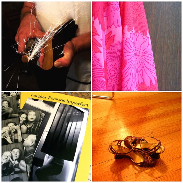
Porcelain (as Blossom) and Cardboard (as Joey Lawrence)

Happy Halloween!!!!

Good Morning...

Horse Head Pillow, at Kropserkel
...and Happy Halloween!

Monday, October 29, 2007

6 & 7

Here are our weekend photos. Visit flickr to see the entire 6 & 7 collection.

Cardboard: left, Porcelain: right

Original inspiration by Stephanie & Mav at 3191

Sunday, October 28, 2007

Oh, Rockies...

Dear Rockies-

Don't feel too bad. You gave it your best. We believe you can get there again next year. Just start practicing now.

Chin up-
Cardboard & Porcelain

ps. So does this mean your gear is on clearance?

Weekend Flings


An Early Start on Design
Eurobad '74 (via : Design*Sponge)
Recycling the Bottle at the Green Glass Company
Chocolate & Zucchini Delivers Deluxe Potatoes
Design Advice from Pros & Peers
Our Halloween Costumes (inspiration seen above; photos seen here!)
A Sweet & Unique Cottage

Friday, October 26, 2007

Cardboard as Fashion

Cardboard on ANTM
I knew cardboard was couture!

For the latest episode of America's Next Top Model, all the lovlies had to pose as/with recyclables. The newly bleached Jenah had the privilege of being cardboard.

The shoes are hot-city and the wide belt over a corrugated dress is nifty but I think I nailed the close-up much better, don't you?

Bonus Bone: Fun Umbrella Stand

Fun Umbrella Stand, available at Austin Modern

I stumbled onto Austin Modern via Desire to Inspire (Thanks Ladies!!). As soon as I saw this fantastic umbrella stand they were selling, I knew it would be my bonus bone this week. I love the contrast between its shiny elegance and its wacky silliness. Meret Oppenheimer's surrealist Table with Bird's Feet came to mind when I first saw it. What a wonderful way to add a bit of pizazz into what is normally a pretty hum-drum item.

For these reasons, I, Porcelain, declare this a Design Boner.

Thursday, October 25, 2007

Cordillera Alpaca Throw

Cordillera Alpaca Throw, available at Garnet Hill

The office where Cardboard and I work has a pretty piss-poor heating and cooling system. Actually it seems like there is only a cooling system and no heat at all. In the wintertime most of our department can be seen wearing scarfs, multiple sweaters, fingerless gloves, and sometimes our hats and coats. I'm considering bringing in a cozy blanket and Hardwood has offered to buy me a space heater. This fuzzy alpaca throw looks warm, cozy and, best of all, it is on sale until October 30.

Juicin' with the Joneses


A little creepy but...also cute.
Creepy/cute.
Crute.

Wednesday, October 24, 2007

Alison Rose: the Blog


Alison Rose, one of our most favoritest designers of handmade stuffs, just created a BLOG! It's a good thing they did too, 'cause they're gettin' all famous and hard to track down.

They've been busy with their new fashion line which just came out and will soon be featured in an alternative OH newspaper. In fact, they're hosting a
release party for the original designs on Nov 2nd. If you're in the Columbus (OH) area, they'd love for you to stop by, nibble some vegan cupcakes, and say, 'Hello, Alison and Nicholas, I'd like to buy this bag/t-shirt/wallet/entire collection."

If you're a little further away, like us, just bookmark their new blog (and
online shop) so you'll never miss out on the bad-ass crafty happenings.

Flying Duck


The first thing I noticed (and liked) about Flying Duck is their homepage: a simple interior rendering that keeps the focus on their vibrant merchandise. Very nice!

Then I checked out the stuff. Their bags, pillows, and wall art, inspired by African textile design, are boldly batiked and vividly patterned. Normally, I find batik to be a tad hokey (with the propensity toward marine life and palm trees and all). But Flying Duck has steered away from that tradition and, instead, focused on yummy color combinations and organic pattern. When used in moderation, these pieces could easily provide that that perfect "pop of color."

And there's not a sea turtle in sight...

Flowering Vine Wall Art

Over the Rainbow Wall Art

Tuesday, October 23, 2007

For Your Breakfast Nook

"Vintage Tiffany Lamp, Red Apple Fruit Hanging Pendant Lamp"

This ceiling light is adorable, in a grandpa-kind-of-way. It makes me want to eat oatmeal and read the funnies.

You too?

Snap it up for only $39 on craigslist.

We're walking away.


Hardwood and I had an inspection on all the common areas of the condo building this past Saturday. The results were not good.

The roof is in terrible condition and it isn't a matter of if but rather when it will need to be replaced (a job that is incredibly expensive and intrusive). In fact, the roof violated a city code. Per code, only 2 layers are allowed. On our roof there were 4 layers in most places and, in some spots, up to 6! That's a lot of weight!! There was water trapped under the roof already as well. The chimney was in bad shape, which our inspector told us, concerned him just as much as the roof. The masonry around the exterior also wasn't in too great shape. And the list goes on! The building received an overall rating of below average. Yikes!! Not good folks, not good!

So we've decided to walk away.

We were depressed on Saturday but now we feel very, very relieved that we found all this out now instead of after we moved in. My advice to anyone buying is to spend an extra $100 or so and get an entire building inspection in addition to your unit inspection. Apparently, the vast majority of people out there do not do this. That money could seriously save you thousands of dollars!!! So please do not skimp on it!

Our mood now has turned to anger. We're pissed at the developers. They made the interior of the unit and the building gorgeous, but skimped on essentials. After talking to several friends who have bought and sold many places and who have worked in construction, I guess this is a rather common practice.


So remember, get an entire building inspection! You'll be glad you did. And if you want a bad-ass inspector, email me.

Monday, October 22, 2007

6 & 7

Here are our weekend photos. Visit flickr to see the entire 6 & 7 collection.

Cardboard: left, Porcelain: right

Original inspiration by Stephanie & Mav at 3191

Saturday, October 20, 2007

Friday, October 19, 2007

Bonus Bone: Star Wars Mirror Art


I'm not really a big Star Wars fan. I feel it's important to see all the films to understand current cultural references but other than that? Meh...

Which is exactly why these four pieces of vintage mirror art must be a Bonus Bone. I think they stand up, independent of the movies, on their design merits alone. The weathered glass and cheap silvery frames show them off to be kitschy yet classic (a quality I rarely dislike). I can see them working in so many ways: horizontally aligned across damask wallpaper, resting atop a mantel, hung child-height in a boy's room, etc.

Since they're selling for $80 for the set, I'll let an true SW fan snap them up. But if, amongst all the action figures and plushy Ewoks, I see this group on display; I might agree to a second date.

For these reasons, I, Cardboard, declare this a Design Boner.

Thursday, October 18, 2007

Can't Touch This


I love my neighborhood.

Wednesday, October 17, 2007

Gimage: Urinal


Tee hee...

Please don't ask why I was gimaging the word "urinal." Some things are better left unexplained. What I do want you to do, however, is help me find this bathroom!

It's obviously a public restroom (due to the fact that there are multiple urinals) and it looks quite clean and polished so I'm going to guess that it's not in a public library. The lone user is dressed all in black so it could be in some kind of nightclub but I've been to a few discotheques in my day and their bathrooms tend to make porto-potties seem sanitary. I'm leaning in the direction of restaurant...

* Gimage = Image found when stated phrase searched in Google

Tuesday, October 16, 2007

Our offer was...

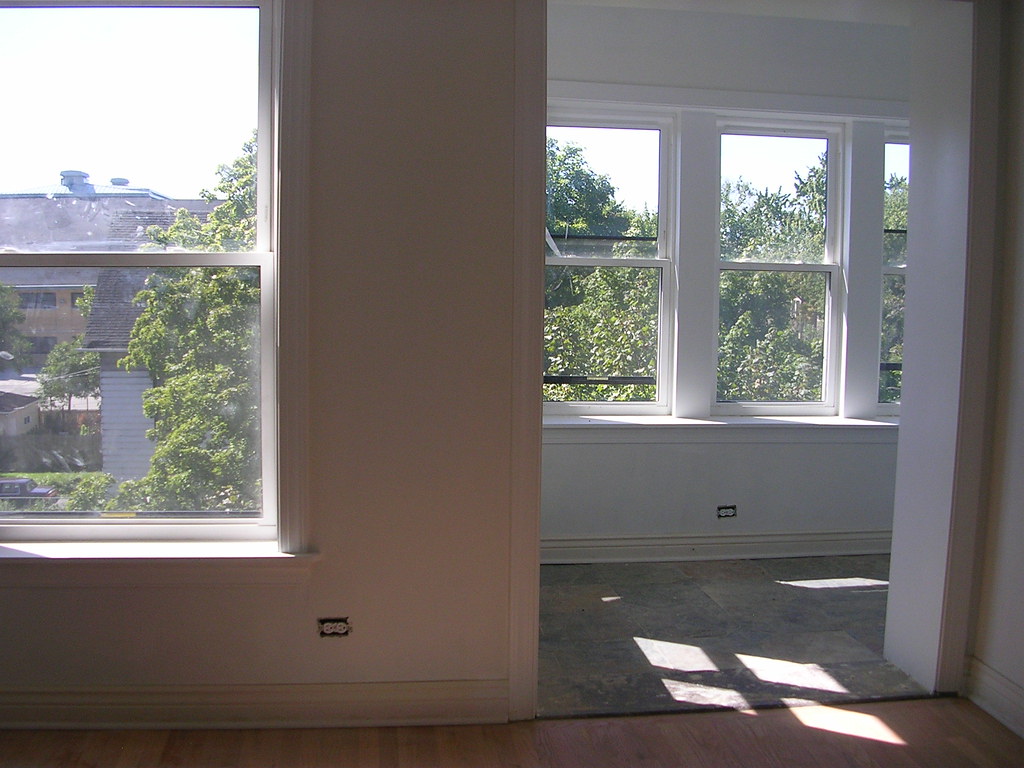
From the master bedroom looking into the living room and sun room


ACCEPTED!!!!!!!


We are now in our attorney review period. All I have to say is that Hardwood is one bad ass negotiator.

Monday, October 15, 2007

Why are most ceiling fans butt ugly?

Hardwood and I want ceiling fans in both of the bedrooms in the new condo we get. So we've been looking around online and also stopped at Lowe's on Sunday. There was not one fan that we liked at the store. All of them were butt ugly!! Seriously who designs some of these things? Captain Kirk on acid? Here is a smattering of some particularly awful ones* I found. I could have posted a lot more, but I didn't want any of our reader's eyes to start bleeding!


*For the good of mankind and design, I'm not even going to bother to link to where to buy these.

6 & 7

Here are our weekend photos. Visit flickr to see the entire 6 & 7 collection.

Cardboard: left, Porcelain: right

Original inspiration by Stephanie & Mav at 3191

Friday, October 12, 2007

Bonus Bone: Hot Cocoa Mug

Hot Cocoa Mug, available at White Forest Pottery

It finally feels like fall here in Chicago and I could not be happier. I love wearing sweaters, snuggling under the covers and drinking lots and lots of warm beverages. I always like to use a special mug, it gives those moments a little extra sparkle. I found out about White Forest Pottery from the lovely Mav from Port2Port. As soon as I saw their work I instantly fell head over heals for their simple yet tactile pottery. The curves of the hot cocoa mug looks like it would fit perfectly in my hand. I don't think I would be able to set the mug down until I slurped down every last drop!

For these reasons, I, Porcelain, declare this a Design Boner.

Thursday, October 11, 2007

May I Take Your Coat?

Hand Job Coat Hook/Wall Art, at Hidden Art Shop
Due to our name, it just seems appropriate...

Wednesday, October 10, 2007

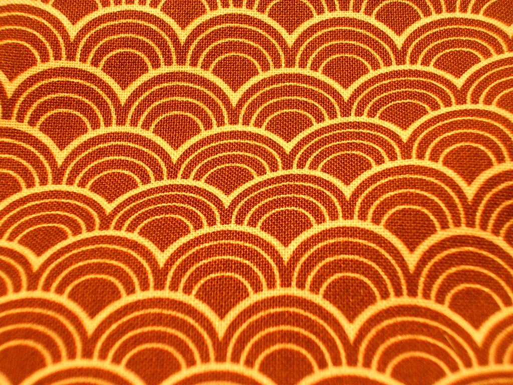
Fabric from Purl Patchwork


Fabric by Joel Dewberry for Westminster, available at Purl Patchwork

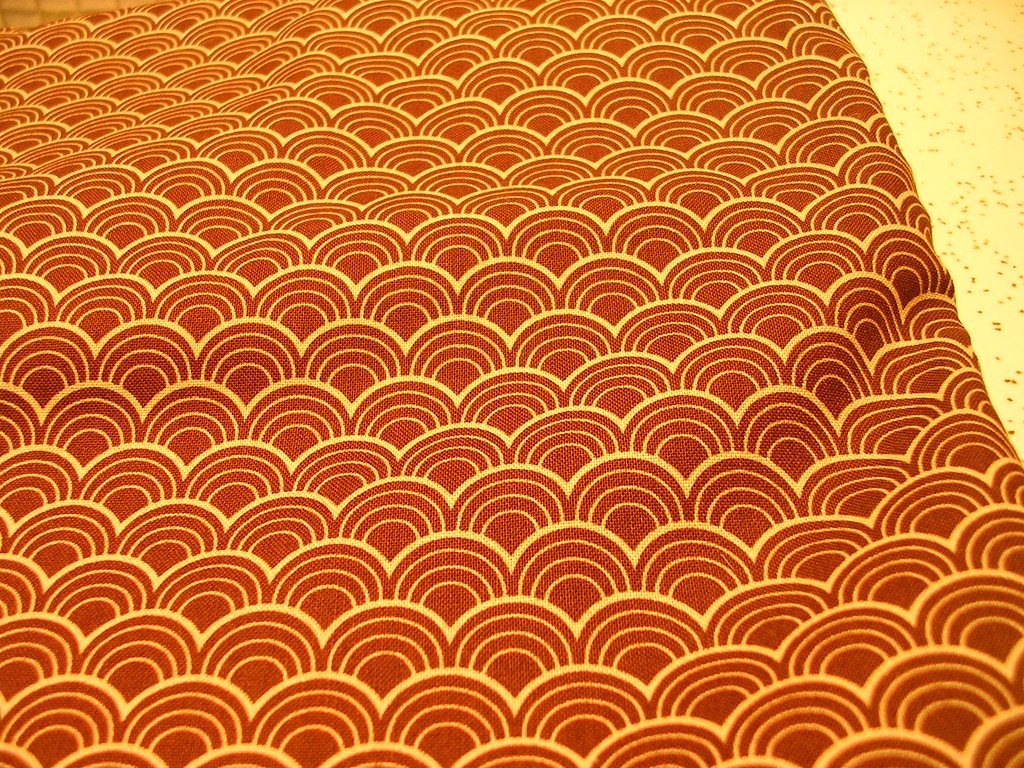
The other weekend Hardwood and I were in New York for work. While Hardwood was stuck in boring meetings (poor thing), I got to gallivant off and play. I met up with my best friend from college and enjoyed a yummy lunch and a little bit of shopping around SoHo and the West Village. The highlight of our shopping trip was stopping at Purl Patchwork. I nearly hyperventilated at all the beautiful fabric. I decided to treat myself and bought a couple yards of this chic Art Deco-ey scale fabric. It reminds me a lot of this wallpaper from Naked & Angry.

Tuesday, October 09, 2007

They countered our offer...


We're negotiating, cupcake!

Image courtesy of Qwerty's Qoncepts

Monday, October 08, 2007

House Tour at the Rock of Love

I feel I need to come clean about something and, even though I'm going against the advice that I should keep this to myself, I must purge myself of this experience.

On Sunday, I lounged around on my couch, in my PJ's, and watched at least six solid hours of VH1's Rock of Love.

I don't know what it was: the weather, the planetary alignment, too much beer the night before; whatever the reason, watching an episodic marathon of a slightly washed-up but down-to-earth rocker, in all his doo-raged and eyelinered glory, woo a whole slew of slutty/hilariously drunken/manipulative but endearing wannabe-rocker chics seemed like the perfect Sunday afternoon activity. At the end of the whole thing, I felt a bit guilty that the only thing that filled my day was tons of '80s hair and a couple plates of nachos, so I've decided to redeem myself and dig something productive out of the whole nasty business. Lucky for me, VH1 posted a house tour!

Design ideas to avoid from the Rock of Love house:

Too much chrome/aluminum in the kitchen

Weird, vacant spaces filled with furniture best suited for the intro scene in a porno

Open stage-hand scaffolding as decoration...
Unless it's outside and then it's kinda cool


Design ideas to steal from the Rock of Love house:


Split graphics on double doors

Collection walls

Trays of nail polish

And my guilty pleasure, my design risk, the one item I'm sure is either totally rad or horribly trashy...

Cheetah-felted pool table
(Please ignore the cheetah-felted stage because that will sway your vote.)


Since Bret Michaels got majorly dissed in the last (reunion) episode, I assume there will be a Rock of Love 2. I'm sending out the official proposal that Porcelain & I can do way better than this place!

Proof: we'd incorporate lots of these :


Ray Table Lamp, by Element Design

Zen and the art of condo bidding

Will this be Porcelain and Hardwood's new home?

On Saturday, Hardwood and I made an offer on a condo. We should get a response sometime today. We are both feeling really calm about the whole situation after months and months of crazy.

Many thanks go to Devon for the best post title ever!

6 & 7

Here are our weekend photos. Visit flickr to see the entire 6 & 7 collection.

Cardboard: left, Porcelain: right

Original inspiration by Stephanie & Mav at 3191

Friday, October 05, 2007

Bonus Bone: Quart Quartet by Small Object

Quart Quartet Can Set, at The Small Object

I simply can't think of a cuter way to contain things! Surrilously...look at all those skinny arms!

For these reasons, I, Cardboard, declare this a Design Boner.

Thursday, October 04, 2007

The Big Yellow House

My mom's house is looking rather pretty lately. Maybe, since I only make it home a couple times a year, I'm seeing it through new eyes. Or maybe I'm only paying attention now because, "I've got blogging to do!" Regardless*, when I do finally get there, I'm noticing lots of sweet little moments.

Second Floor Back Deck, off Master Bedroom

Dining Room
(it was 6am - please excuse darkness)

Detail, Dining Room

FOUND Glass Collection
(unearthed when we dug out space for a deck in our backyard)

Freshly-Organized Garage

* I honestly think her house looks better because us kids done moved out. Finding time for design is probably easier when one doesn't have three boogery babies>messy kids>destructive teenagers to worry about. Happy birthday, Mama C.