Tuesday, August 29, 2006

I see monkeys!

Yesterday I scoured the web looking for lamps. I checked out the selection at Z Gallerie and nothing really screamed out at me, until the very last page where I found this lamp...

Bell Hop Monkey Lamp, at Z Gallerie

I know I've seen this ridiculous, insane monkey lamp before, but where? Then it hit me, it was at Mode, probably one of the craziest stores I've ever been to.


If you're lucky it might still be there and it would definitely cost less than $80! Let us know if you go dig it out.

Friday, August 25, 2006

Bonus Bone: Pug Pillow

I feel I really have to explain my choice here. Normally, I wouldn't get excited about a needlepoint pillow. They're fussy (mixing velvet with satin and fringe and tassels) or they're supremely tacky (letting us know that "Nothin' says lovin' like Big Mama's oven"). They can be sweet and simple but, normally, it's not a style I gravitate towards. Until now...

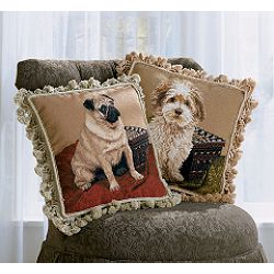
Pedigree Needlepoint Pillows

I love the pug pillow! Ever since I spent a long weekend walking a friend's nasally-challenged pug up and down Old Orchard Beach, I have been in love with the breed. The snorting sounds, the roly barrel body, the Dr.Seussian curlicue tail - I can't get enough! Yet, for many reasons, I do not have a pug to call my own. This pillow might just have to do until that fine day when I bring my own little sausage body home.

I found this pillow about a year ago and I really can't recall how I stumbled across it.
Sears (of all places) sells the pillow in the pug design or the terrier. Both pillows have excellent kitsch factor and the terrier is cute but it doesn't grab my heart like the pug. Sears is probably marketing the pillow to:
1. Women.
2. Women who browse Sears.
3. Women who browse Sears, feed their triplet pugs at the dinner table, and outfit them in leopard print coats and rhinestone collars.

Regardless, I like the idea of owning this pillow but not actually owning the dog. At $50 a pop, they're a little pricey to be so ridiculously ghastly but they would fit so well into the
'dog' motif of my living room. And (hopefully) they don't shed.

For these reasons, I, Cardboard, declare this a Design Boner.

Thursday, August 24, 2006

Reflection on Unused Space

Foolin' around in Flickr just now and found this photo. I think it's a fun way to spice up a rather neutral (blah) kitchen. She artfully highlights the odd shapes of the mirrors in an unused but everyday space. I think the mirror that leans against the wall (behind the faucet) can go though; it subtracts from the arrangement.

Thanks for sharing, retired widow!

Wednesday, August 23, 2006

Naked & Angry


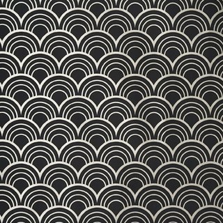
Heavenly Scales by Richard Lee


Parsley A by Kimberley Crofts


I love it when local Chicago companies receive a lot of much deserved attention! Naked & Angry has been popping up in a few blogs recently (here, here & here). They're an affiliate of Threadless (both skinnyCorp companies) and both share the same design submission process: Anyone can submit a design, the people vote, after seven days the design is given a final score, the highest scoring designs are manufactured, and the winning designers receive $500 and five free Naked & Angry items.

Naked & Angry's first series consists of silk neck ties. Their second series consists of bold hand-screened wallcoverings. I like that Naked & Angry encourage you to be creative with how you use this paper. Heavenly Scales is my favorite of the bunch and I think it would be very sexy inside your underpants drawer. I love the idea of hiding the boldness and giving a mundane area a big jolt of pizzazz!!!

"Furniture with a Soul"

I've never heard of Nadeau Imports before but they've heard of me. I received a postcard in the mail the other day telling me that they're having a ONE DAY ONLY sale. Apparently, Nadeau Imports supplies stores, such as Pottery Barn, with furniture found in China, India, and Indonesia. This Saturday, they're opening their warehouse doors to the public and offering discounted prices.

Here are some fun pieces from their online catalog:
Iron Love Bench - India


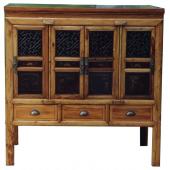
Small Buffet - China

Teak Canopy Day Bed - Indonesia

I'm going to check it out because I've been looking for a large basket/ottoman thing that I can dump my shoes in and hide. Much like this:

Open Stool (set of 2) - Indonesia

Nadeau Wholesale Warehouse
4433 N. Ravenswood Ave.
Chicago, IL 60640
773-728-3497
Saturday, August 26th
10am - 4pm

Tuesday, August 22, 2006

Gimage: Can't go wrong with tiny

I've gotten some very cute suggestions for cream & sugar containers. My favorite (so far) is M. Patrizio's recommendation from Art Star.

But then Mama Cardboard emailed me and said that she has a set that used to belong to Grandmother Cardboard. She described it as glass (blue & milky white) and tiny. Although I really, really like this set with its orange (red?) atoms & neutrons, I think I'm going to try the turquoise set first.
Porcelain illustrates my reasoning AND inspires the following gimage; "...you can never go wrong with something tiny." Well put.

Monday, August 21, 2006

On second thought...

While looking through additional Ultraglas photos, I see that this textured glass thing has the opportunity of going terribly awry.
Proceed with caution...

HIGH ALERT!

Textured Glass

Mama Cardboard is finally re-doing her ancient bathroom. We will be posting before/after images for this project soon! I've been helping out with tile decisions, paint colors, which direction to lay the hardwood floor, etc. Basically, I have bathroom design on the brain.

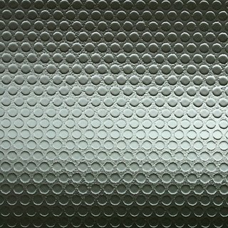
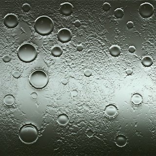
While bopping about the internet, I discovered UltraGlas, a company in California that makes textured glass. Although they work on all kinds of installations (from bar tops to flooring), I think they would make a really neat privacy window for a bathroom.

Here are my top 3 designs (the light and shadow are photographed through the glass):


Fine Lines

Dots

Bubbles

The price is probably ridiculous and, after seeing their online portfolio, I realize that they are accustomed to much larger jobs. But a "Dots" window could be something really fun and just a little bit different.

What do you think, Mama C.?

Friday, August 18, 2006

H.E.L.P. Arrives in tiny Packages

Lately, I have noticed a big emphasis on small. Web sites, like Apartment Therapy, and design programs, such as Small Space, Big Style, try to show that one doesn't need a lot of space to design or, more importantly, to live.

H.E.L.P House
Last night, I caught a bit of Small Space, Big Style and have been thinking about what I saw all throughout today. Inspired by the instant homeless epidemic caused by Hurricane Katrina, two Maryland-based architects designed a portable house that they hope, one day, will be used by the government to house displaced citizens after disasters. Carib Martin and Rob Bragan built their prototype, H.E.L.P House (Housing Every Last Person), in Martin's driveway for $8,000. The interior is full of fogged plastic and trendy light wood. It can sleep 6 people, includes an outdoor seating area, and the total square footage measures out to less than 100 square feet!

Kitchen, H.E.L.P House
Although the prototype is still sitting in Martin's driveway, it's designed to ship anywhere. The entire porch can be dismantled and stored inside. The house is meant to rest temporarily on the property owner's land while the home owner rebuilds. Since disasters often render necessities such as electricity and plumbing impossible, Martin and Bragan have also installed solar panels and something they called a "composting toilet."

Speaking of toilets, I couldn't find a photo to illustrate this, but the entire bathroom is smaller than the typical shower stall. Just close your eyes and think of your feet resting on the shower floor while you sit on the potty and you got it.

Living area, H.E.L.P House
It's a complete stretch of my imagination to picture myself in a space this small. I have a hard time even picturing myself in a NYC apartment! But this concept, when paired with the idea of losing everything, makes me pause for a moment and think of the people who would feel lucky to call this tiny box home.
photo credit: NPR

Bonus Bone: Hix Island House


La Casita


Casa Triangular - The Studio


Casa Redonda - Loft 4


“La Casona” (The Grand House) at Hix Island House

My husband and I got married last year and for our honeymoon we wanted to go somewhere very chilled out and beautiful. One of our top choices was the Hix Island House on the island of Vieques, built by the architect John Hix. What attracted us to this place was the beautiful, modern architecture and how it interacts with the natural landscape. Hix strives to make his buildings fit with nature. Ecology is also important at Hix Island House. Solar panels augment the electricity and hot water. The waste water from showers and sink basins is collected and flows out to feed guavas, bananas, papayas, and lemons.

It really does look like you become one with nature. What a perfect way to relax and regroup!

For these reasons, I, Porcelain, declare this a Design Boner.

Thursday, August 17, 2006

Still hunting for sugar and cream...

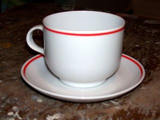
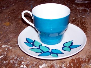
To see what I'm working with, I will show you photos of my teacups. Ideally, I would like to find a cream/sugar set that will work with either style of cup/saucer.

Option 1:
A simple, rounded design of crisp white ceramic with a thin orange line that runs the circumference of both saucer and cup.
Option 2:
A curvy style, retro in nature, which boasts a teacup of teal and white against a saucer with a playful whisp of leaves in the same teal and aqua.
Now after seeing my cups, can you maketh them run over with sugar and cream? Help me find a sugar & cream set to match!

Wednesday, August 16, 2006

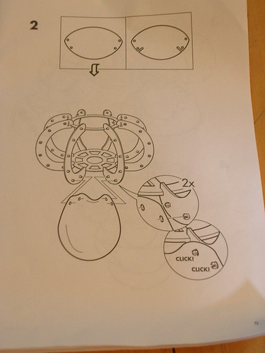
Brain Teaser: IKEA instructions

A couple weeks ago, I went to jury duty way out in BFE (aka Rolling Meadows, Illinois). I knew that was out there, but I didn't know how far. I was lucky enough to have a friend offer me the use of her car. When I neared the end of my car ride, my eyes brightened and I was suddenly happy to have jury duty way out in BFE, for IKEA was just a 5 minute drive from the courthouse. After I performed my civic duty, I took my $17 from the State of Illinois and went to IKEA!

I thought the KNAPPA pendant lamp would be a funky alternative to a bedside table lamp and would free up some prime real estate for an alarm clock and carafe on the table. When I picked it up in the lighting section, I was surprised to find it in such a small box. I should have known that there it would come in a million little pieces and be a pain in the butt to put together.

The instructions started off easy enough, but after Step 1, I was a goner. IKEA instructs you to assemble the light upside down and, combined with their half-assed pictures, I could not wrap my head around which way to bend the little plastic bits. I think IKEA should include this warning on all of their instructions: Do not put this product together immediately after a trip to our store. Take a nap or have a big glass of wine to clear your head and calm your nerves.


Say what? Which way do I bend this sucker?!

After several attempts, I put the parts down in frustration and decided to come back to it the next day. A good night's sleep and a cup of coffee was all I needed. I threw IKEA's directions out the window (not literally) and flew by the seat of my pants. I decided to assemble it right-side up and - BOOM - it finally clicked. Once I figured out which way to bend the plastic parts, the lamp was assembled in less than 10 minutes.
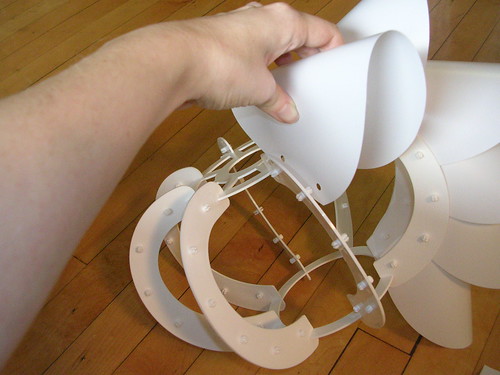
My AH-HA moment! This is the way you bend it.

TA DA!!!

I am really happy with the end result and I think it looks great. Plus my bedside table isn't so cluttery! For more photos, go here.

Tuesday, August 15, 2006

Sugar, no Cream

Daisies Cream & Sugar Set by Jolly Good Tea & Gifts
It happened again. I had some neighbors over to my place for a meeting on Sunday afternoon. I decided it would be a nice thought to have coffee on hand. I don't serve coffee (or tea) to guests very often but when I do, I get excited about it and like to have it just right. I have cups and matching saucers. I have a nice serving tray. I can substitute another cup for a sugar dish because I do have tiny spoons for stirring. However, the one thing I don't have and can't scrounge up is a cute container to hold the cream. It's that whole pouring lip. A measuring cup lacks showmanship and a juice pitcher holds WAY too many calories. Nothing else will work.

I would like to find a sweet little set. My mom has a cream pourer in the shape of a cow. I've always liked it but there's no sugar match.

Does anyone have any ideas of where to start looking? I don't have any particular style in mind; fun and not-too-expensive are my main requirements!

Friday, August 11, 2006

Cute.

It all started with Porcelain and I searching google to determine the breed of Charlotte's dog, Elizabeth Taylor, on Sex and the City. We got lost in the pages and pages of adorable puppy photos. That's all it took; we cooed and awww'ed, opened wide, and swallowed the cute pill whole.

Here are some of our favorite smooshy-whooshy-cutesy-wanna-tuck-you-in-my-pocket-foreverandever finds:Mr & Mini Sun
Button
Minor Celebrities
Lopsy

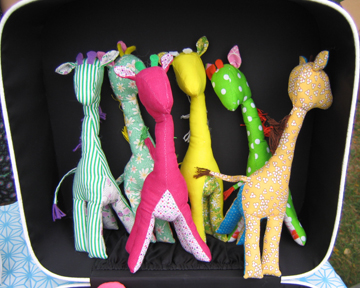
qylaar, a girl + boy staple at local craft fairs, makes the sweetest hand-sewn animals.
qylaar's giraffes

At Stupid Creatures, all you need to do is send in a check and a couple of socks and you get your very own one-of-a-kind playmate.
For finding (and creating) all the cute in design, M. Patrizio's blog may be unrivaled.

Bonus Bone: Hammocks

It's August...

For this reason, I, Cardboard, declare this a Design Boner.

Saturday, August 05, 2006

The Design of the Music

A friend of ours was recently inspired by our shiny, new blog and decided to start one of his own. It's about music not design but it's still worth a peek!

I decided to draw him up a photoshop sketch to usher him into the world of blogging. His girlfriend is the one who designed our "logo" so now, I guess, it's tradition.

Welcome to blogging, Who Killed the Mixtape?!

Boot Room

Flipping through the latest Anthropologie catalog, I fell in love with two pairs of boots. They're HAWT.
The basic:

And the sassy:

fifteen minute boots, $558.00
I really just wanted to show off these boots but I can put a design spin on it. Imagine a den or a library decorated around these two pairs of boots. I would install one full wall of bookshelves and stain them a deep molasses brown. I'd furnish with rich leather chairs, also brown and studded. The walls would be Venetian plaster in a moody red, with hints of gold to bring depth to the shade. Then I'd pull in the accent of tarnished brass: on lamps, sconce lighting, pencil cups, fireplace pokers, and throw pillows. And I haven't quite thought about the colors yet but I'm fairly certain the drapes would be in a stripe.

Friday, August 04, 2006

Gimage: Civic Duty

Does this mean that purple is our design "civic duty?"
I hope not because, if it is, I'm an anarchist.
Porcelain is all tied up today. She's doing her civic duty and sitting in for jury duty. Hopefully, she won't be selected for the next OJ trial and have to miss three months of her life.

Since she's gone, I played a fun trick and added in the Teletubbies link to her previous post. I've only seen one Teletubbies episode and it was about "Dirty Knees." They had a song about dirty knees and everything. From that moment on, it's all I can think about when I see/hear the phrase.

Bonus Bone: Family Summer Vacation

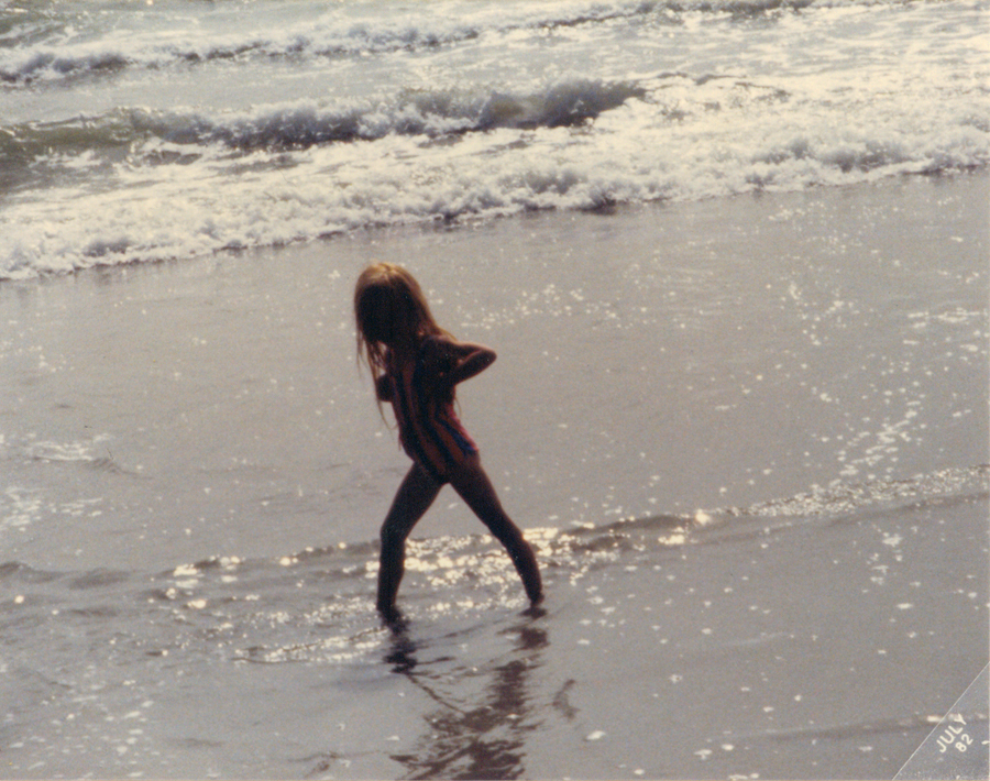
Porcelain strutting her stuff in the Pacific Ocean.

During this sweltering heat wave, I thought about growing up and not living in an air conditioned house. How did we do it? The other thing I thought about is FAMILY SUMMER VACATION! My Dad worked for General Motors and every July the Big 3 shut down for two weeks, which is when we’d take our annual summer vacation. We went camping, took road trips, visited friends and family, rented beach houses, and went to both Disneyworld AND Disneyland! We traveled from coast to coast, down to Mexico and up to Canada and almost always pulled our pop-up camper along with us. Eventually, we upgraded to an Airstream trailer, fondly dubbed the "Silver Twinkie."

You’d think my favorite vacation would be when we went camping at Disneyworld but you'd be wrong. Sleeping in a pop-up camper with three older brothers, 2 parents, and 1 oscillating fan in the middle of a humid Florida July is not what I call fun! No, my favorite vacation was when we rented a big beach house with my grandmother, aunts and uncles, and some cousins in Kitty Hawk, North Carolina. It was glorious to wake up to the sound of the waves, see the beach from our porch, and smell the sea air. We grilled fish, tried to spot dolphins, boogie-boarded, and I read my first trashy romance novel. Perfect beach reading!

I cherish these carefree vacations. My memories are filled with marshmallows, camp fires, sleeping bags, Faygo pop, games of Skip-bo and Solitare, dirty knees, and hours upon hours spent in the water.
For these reasons, I, Porcelain, declare this a Design Boner.