Friday, June 30, 2006
Gimage: Happy Camera
To our #1 fan (paper lily), and our regular readers (Janel and my mom), thanks for your support. We're back and comin' at you with mad, craZy photos!
Bonus Bone: Orange & Green

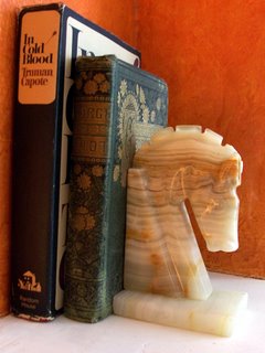
In this particular example, I collected a lovely old pine-colored book (I don't even remember what the title is), a vintage copy of In Cold Blood, and a marble end piece in the regal shape of a chess player's Knight. When these objects arranged themselves against my orange wall, I wiped my hands and exclaimed, "Done!". It's a small moment in the big picture of all things decorating but, to me, it's quiet perfection.
Tuesday, June 27, 2006
Gimage: Stupid Camera
 Gimage = Image I found when I searched "stupid camera" in Google
 Friday, June 23, 2006
Bonus Bone: Self-watering flowerpot

I confess! I'm a bit of a lazy gardener!!! (In fact I haven't even planted anything this summer.) I start out with the best of intentions to water daily. This goes on for a few weeks straight, maybe a month, tops, and then the heat of the summer infiltrates my brain and I start to SLACK! Right as I walk through my front door, I tend to wilt and collapse onto the couch in front of the window AC. The thought of going outside, back into the heat and humidity, keeps me planted. What? I have to water the cats AND plants? Too hot! Too much work! Must...not...break...sweat...
By the time the heat wave breaks, my lovely little herbs and tomato plants are rather pathetic, slightly yellowed and shriveled. Get these plants to the ER and STAT! Do you think my insurance will cover this? If only there was someone or something that would water for me. Now there is help for lazy gardeners like me or good ones who are away on vacation, the self-watering flowerpot! Designed by Henrik Holbaek and Claus Jensen, this ingenious pot will hydrate your plants for a week or longer through a of system nylon wicks that draw water up like the plant's natural roots.
For these reasons, I, Porcelain, declare this a Design Boner.
Craft Fair!
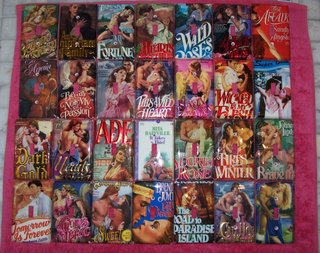 I take boring ol' switch plates and enlighten them with the covers of trashy romance novels. They're really quite fun and this batch (see above) is the most I've ever had completed at one time. They will all be on sale in Milwaukee tomorrow! I hope you make the trip out and check out all the spectacular wares!
Saturday, June 24th
1025 N. Broadway
Milwaukee, WI
10am-7pm
$2 admission fee
So instead of plopping yourself down on the sofa and zoning out to another My Fair Brady marathon, come up to Milwaukee and support independent merchants!
Thursday, June 22, 2006
Design Hindrance
I need your help!
I know they can run because every time I open the basement door, they scatter as if caught shoplifting almonds at Whole Foods.
I bought a NO-KILL trap and caught one beast with a tiny but delicious peanut butter and white bread sandwich. It took about three days to lure the first one into the trap. But now it's been two weeks and the second one is holding out. I've tried peanut butter, oatmeal, molasses, nuts, Cinna Stix from Domino's Pizza...
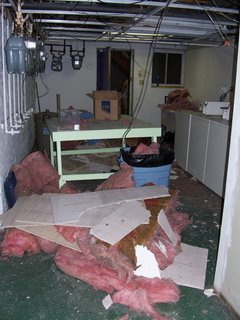
I beg you to help me catch this wily little devil so that the ceiling reparations may begin. I'm trying out a new plastic paneled ceiling and I'm excited to get going on it. Plus, I'm not too keen on the creepy cable snakes (see photo above) that drop down and brush against the back of my neck while I'm loading my dirties.
Let the advising begin!
Monday, June 19, 2006
Mass Modern auction rehash

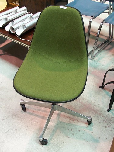
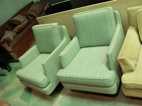
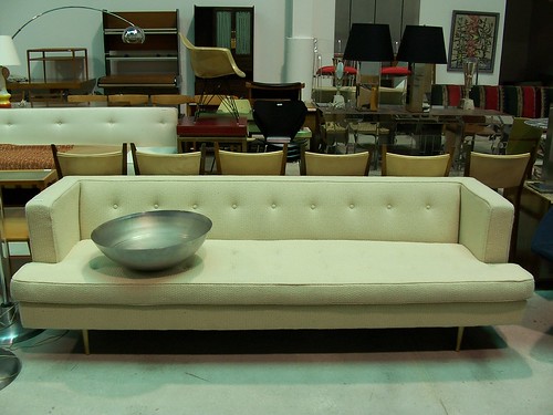
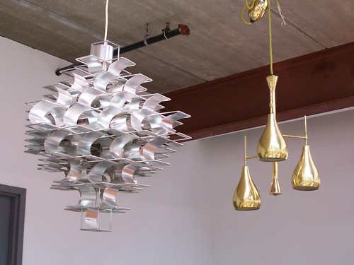
Cardboard and I attended the Mass Modern Auction at Wright this past Saturday. We were interested in checking out how the auction operated and looking at all the furniture in person. Maybe, if we were lucky, our sugar daddies would dig deep enough and we'd leave with a new addition to one of our homes. There were several rooms FILLED with furniture, art, lighting, accessories, etc. We had a great time opening doors and doors, sitting down at a Frank Gehry cardboard dining set, touching the material, snapping photos, and drinking complementary Izze sodas. Our two favorite pieces were an adorable teal dressing table with off-centered mirror and a pair of Edward Wormley swivel lounge chairs. We were both somewhat surprised by the condition of quite a few of the pieces (not all that great). The photos online seemed slightly deceiving. The furniture was obviously well loved by someone and would need quite a bit of rehab to restore them to their former glory.
The majority of the buyers seemed to be serious collectors and dealers. Prices ranged from $25 for a pair of furry, brown chairs (which Cardboard delightfully named the Fozzie Bear chairs) to a pair of Charles and Ray Eames small side cabinets for $10,000! Yes, that's right $10,000, American dollars!!
Despite walking away with nothing and being a bit shocked by some of the skyrocketing prices, we still had a fun time observing the bidders, enjoying the snacks and beverages, and lusting after a pair of round brass lamps! To check out some additional photos from the auction, go here.
Friday, June 16, 2006
Bonus Bone: Furoshiki
 One thing I love to do, especially on a rainy day, is wrap presents. I like to use whatever I've got around the house and I always try to spiff it up a bit and make the wrapper look just as good as whatever may be inside the box. So it's rather peculiar that, until yesterday, I had never heard of furoshiki.
Furoshiki is a Japanese tradition of wrapping gifts in fabric. Often, this presentation is reserved for food items or bottles of liquor but, according to my internet searches, anything can be wrapped in fabric and made to look ever so pretty. Japanese custom states that the gift receiver should unwrap the furoshiki and fold it neatly. Then when it's time for everyone to go home, the small cloth is "returned to the giver by placing something small in it for the gift giver to take home." * What a lovely idea! So next time you're off to a dinner party, try wrapping that bottle of cheap wine in a furoshiki and you may just walk out with a dainty guest soap or your host's TV remote control.
For these reasons, I, Cardboard, declare this a Design Boner.
Instructions on wrapping a bottle of wine or sake: *
-Place the bottle in the center of your furoshiki. The cloth must be fairly small and square. I experimented with longer, scarf-like materials and there was simply too much cloth floating around.
-Bring two diagonal corners together and knot them on top of the bottle.
-Pull the other two corners toward you, around the bottle, and knot them on the face of the bottle.
-Kanpai! Your first furoshiki!
Lead image: Professional furoshiki
Thursday, June 15, 2006
Gimage: Design Boner
To introduce this activity into our blog, I scanned the room behind me, closed my eyes, and typed in "Design Boner." The reason I was nervous should be so obvious! But my fears were completely unfounded as I found myself face-to-screen with this delightful representation of our online journal...
 I would credit this photo but the website no longer exists.
Tuesday, June 13, 2006
Chairs are in the Air
Sigh.
But this year I came across Judy Hinkes Zeddies. This delightful Chicago printmaker focuses on interiors, with a heavy slant toward chairs. I am such a sucker for a good chair rendition! Her pieces are uncomplicated yet have depth. This elusive combination and the fact that the price tag was a mere $60, propelled me to purchase one of her monoprints. If you love her work too but missed her, don't worry. She's returning to Chicago in August for the Bucktown Arts Fest.
And while we're on the subject of artistic chairs, I'm very fond of Robert's Chair Tote. This is a great example of how such an ordinary object can be abstracted into the beautiful.
Mass Modern – Modern Design at Modest Prices

Paul McCobb Planner group drop-leaf dining table

Arne Jacobsen chairs

Anna Castelli rolling storage cube
Modern Design at reasonable prices!?!??!!!!! I am there!
Wright Presents: Mass Modern – Modern Design at Modest Prices Auction
17 June 2006 11am
Viewing 12-16 June 2006 10am – 5pm
Most items sold with no reserve
Free admission and parking
Catalogs available
1440 West Hubbard Street
Chicago, Illinois 60622
312 563 0020
www.wright20.com
Monday, June 12, 2006
Modern Warehouse


Two of my favorite things in this world are the city of London and Danish modern furniture. I’ve died and gone to heaven with London based Modern Warehouse. Their website is filled with beautiful examples of Danish classics in teak and rosewood, 60’s classics, impressive reproductions, art, and the funkiest assortment of accessories that side of the pond. All I need now is a plane ticket and to win the lottery.
Friday, June 09, 2006
Paper Hunt
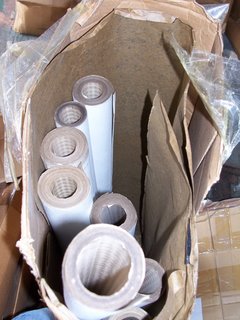 Thanks to a tip off from our friends at Apartment Therapy - Chicago, I played hooky from work today and went out to grab some free wallpaper!
 Maya Romanoff, a local high-end wallpaper manufacturer sold their storage space and needed to clean house. I visited their website and was hoping to find rolls of the metal leaf, natural fibers, or even the Beadazzled (seriously!) collection. Alas, no such luck. Yet I stood among 20 or so other scavengers, waiting, until the doors opened at 2:30pm. We rifled through the older collections, boxed and rolled, stacked crazy-like in the basement and garage. I nabbed a couple rolls with great texture and a neat herringbone pattern in three different shades: sage green, soft grey, and a pale but lively yellow.
I don't exactly know what I'll do with all this wallpaper or even if I'll end up using it at all. But I am a firm believer in taking what you can get when you can get it and seeing how it all fits together later. This might explain why I have so much....stuff.
Bonus Bone: float champagne flutes
For these reasons, I, Porcelain, declare this a Design Boner. CHEERS!
Wednesday, June 07, 2006
Welcome to Design Boner
Hopefully, now you understand the origin of our name. We’re not designers (not yet anyway) but our love of form, of color and pattern, isn’t learned in school. We’re not going to thrust upon you big design words or unachievable environments. We’re just two giddy girls (with lots of helpful friends) who notice our surroundings and want to share what we love. And, of course, we want to hear from you too.
But we know what you’re thinking. What kind of pervy site…No! Our families and mothers’ friends are going to be reading this. Our intention isn’t to embarrass anyone. So let’s just get it all out of our systems:
 There. That’s it! That's all you get.
 Now just sit back and prepare to get rubbed the right way (design-wise, you sicko).


